What was done
Brand
Visual identity
Manual
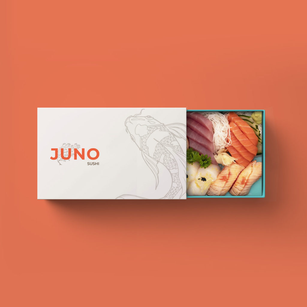
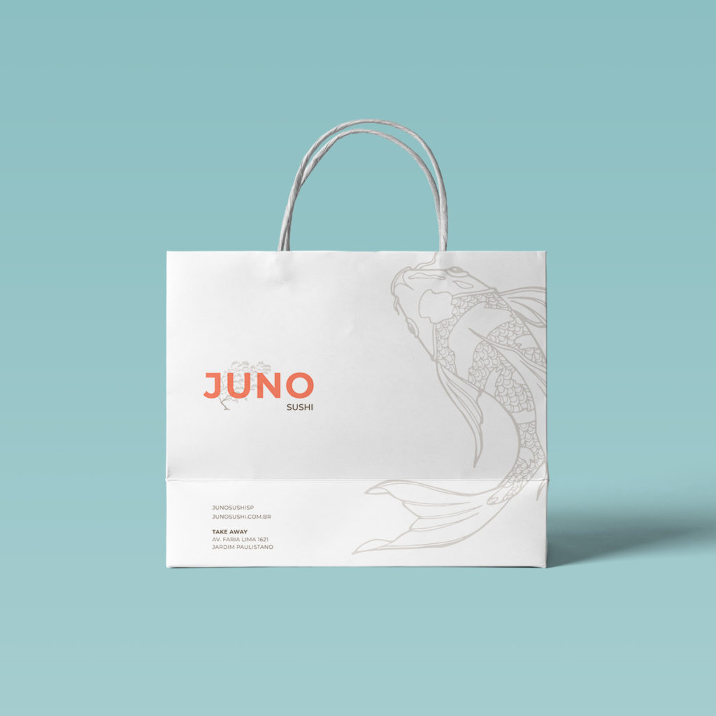
Packaging
juno branding
Juno is a Japanese delivery restaurant located in São Paulo. “Ju” means tree and at the same time, longevity. “No” means field.
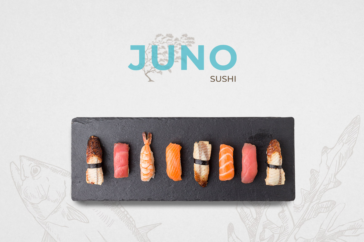
With this, I proposed a tree illustration inspired by Japanese art with the superimposition of its name and soft transparency, bringing lightness and sophistication to the brand. The typography used has straight shapes that give it grandeur and make its look more contemporary. The color is salmon, a popular fish in sushi for Brazilians; and brown wood. It also has a blue color variation reminiscent of the sea.


