
What was done
Naming
Brand
Visual identity
Packaging
ice cream is happiness
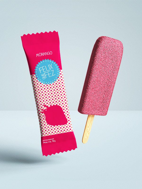
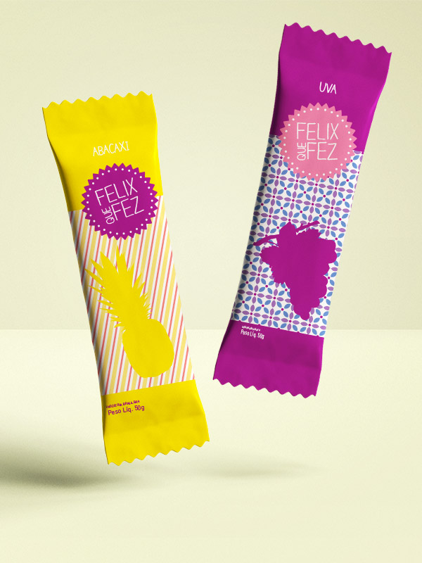
Project carried out for a popular ice cream brand in Campos do Jordão. Felix (founder's name) means “happiness” in Latin, which reinforces the ice cream's purpose of bringing a moment of pleasure to the consumer. The name “Felix que faz” brings an irreverent, human tone that shows that someone made it with care for you.
The visual identity follows “flat” style illustrations, with striking color patterns that deviate from the hyper-realistic images with splashes of cream and 3D fruits of most of its competitors.
This project was showcased on the renowned packaging portal The Dieline and published in Hong Kong's Commercial Illustration book. Unfortunately it was not approved by the client, but here is the opportunity to show work that could boost the promotion of a future ice cream brand.
*If you are interested, send a message 😉

